Comparison
One UI 5.0 vs iOS 16 – Can Apple compete with Samsung’s customizable Always on Display?

Always On Display, also known as AOD, is on of the most useful and famed features of Samsung smartphones for ages. Whereas, Apple has introduced its AOD feature just a few months ago. And, in this article, I am going to compare Samsung One UI 5.0 Always On Display feature with Apple iOS 16 Always On Display.
Aren’t you excited to see if the most awaited iPhone AOD can compete with Samsung’s customizable Always on Display or not? Let’s check it out in this comparison story.
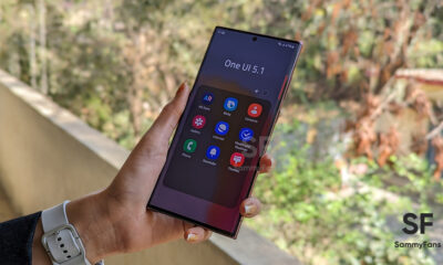
One UI 5.0 Always on Display
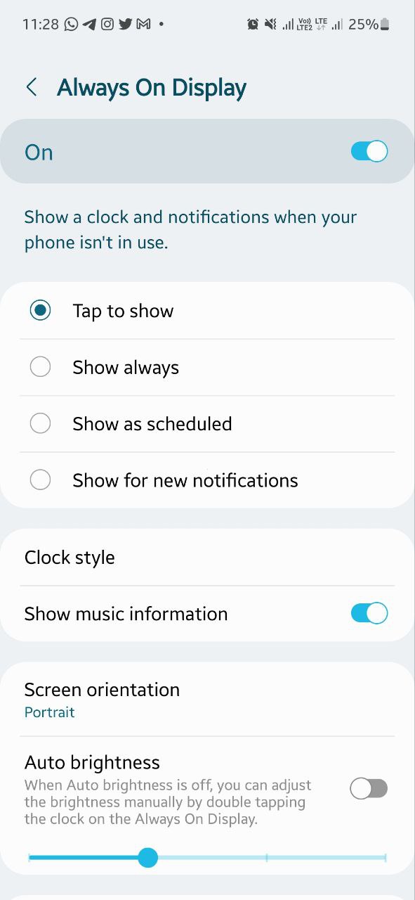
Samsung has been offering the Always On Display feature for years and over time, the company has significantly improved it. Obviously, this feature shows time, date, notifications, missed calls, battery level, and other essential information without unlocking your phone but there are much more.

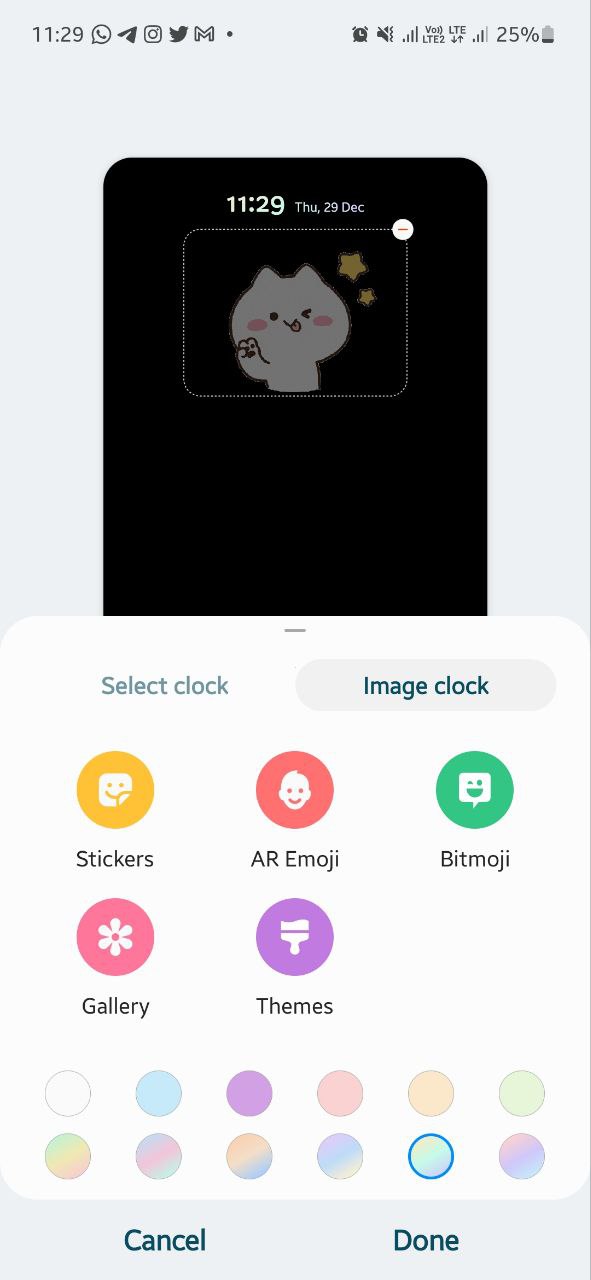
At the same time, One UI offers users a variety of clocks styles and AOD designs, you can choose colors and wallpapers or can even select a picture from the gallery to put on your Always On Display screen.
Besides the basics, it also presents many widgets on the AOD screen by double-tapping the clock area, and can easily play music off-screen, or check schedules and alarms. Not only this, but you can also pin text and images that you want to remember every time.
In addition to all this, Samsung also offers its Galaxy devices to apply AOD in the landscape. You can select whether you want to see AOD while tapping or always. If that’s not enough, you can even schedule AOD on Samsung. And, if you want your AOD to show new notifications or the fingerprint icon, you can enable these options as well.

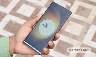
iOS 16 Always on Display
To be honest, I was pretty excited to see the Always On Display making its way to Apple iPhones. The US company has introduced a completely different AOD from the ‘traditional’ feature that we see on Samsung or other Android phones. It has an abundance of elements on the screen at all times.
The initial implementation on iOS 16 just dimmed out the display. It did not turn any pixels off, nor did it blacken out the background, which means you’ll still see parts of your wallpaper on the screen. But things have been changed with iOS 16.2 as it offers you the ability to disable the wallpaper portion, which will make the background black just like a usual AOD.
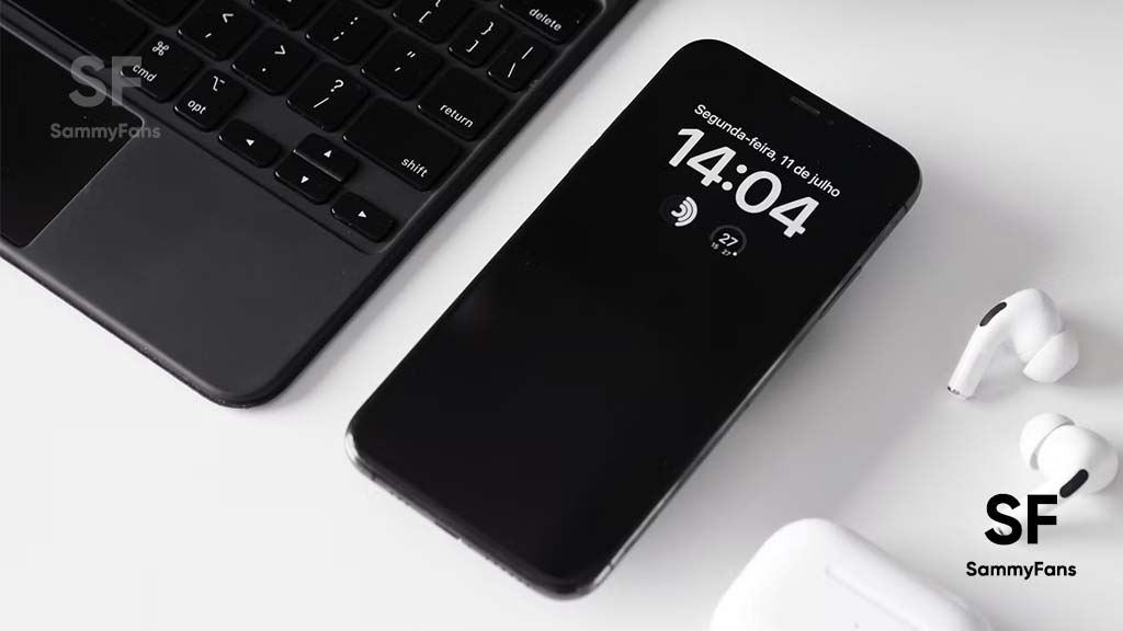
Other than this, the Always-On display on iPhones shows helpful information, including the time, widgets, and wallpaper, all while using new technologies that make the display incredibly power efficient. On the other hand, you can also disable Notification from the AOD.
It is worth mentioning that Apple AOD is not actually part of iOS 16 software, it is introduced with iPhone 14 series, and maybe it will expand to older devices in the future.

One UI 5.0 vs iOS 16 – Always on Display
Apple’s implementation of the Always on Display feature is admittedly creative, but it’s a classic example of choosing form over function, meaning it’s pretty but not particularly useful.
Samsung’s approach to AOD, on the other hand, makes so much more sense. After all, the main motive of Always on Display is to provide essential information at a glance.
If you are thinking that Apple has introduced AOD for the first time so the company will take some time to make it perfect. You may be right but let me tell you that even years ago Samsung’s AOD was better than the current Apple AOD.
So, Apple iOS 16 Always On Display cannot compete with Samsung One UI 5.0 Always On Display in any way, at least now.


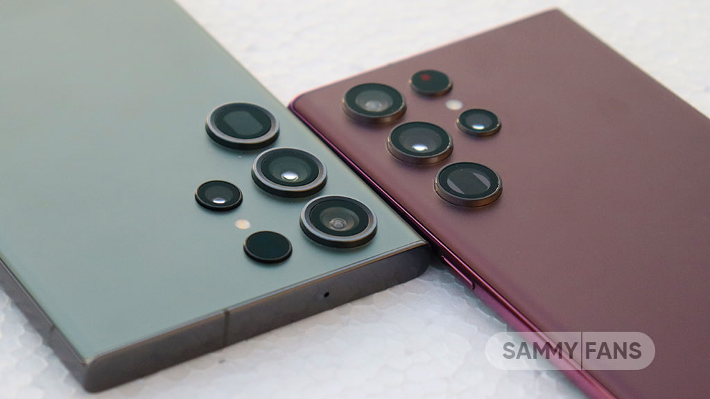
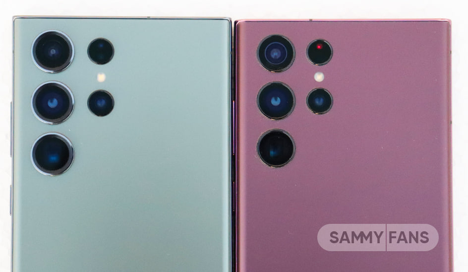
Samsung Galaxy S23 Ultra is a camera beast and brings a massive upgrade in features as compared to S22 Ultra but the design of this successor needs to be explored. In that case, we’ll have to do a comparison.
For your information, this comparison will look into the structure, layout, shape, lens count, and some key specifications of the rear camera module.
Design:
First comes the Galaxy S22 Ultra, which features a quad camera including a laser autofocus sensor and an LED flash. This system has two columns, the left side starts with a 12MP ultra wide-angle camera, followed by a 108MP wide-angle/main camera and the third one is a 10MP 10x periscope zoom camera.
The second column consists of a laser autofocus, an LED flash, and a secondary telephoto camera, capable of 3x zoom. Actually, the S22 Ultra resembles the S21 Ultra but without that large camera bump.
(Samsung Galaxy S23 Ultra – Left, Galaxy S22 Ultra – Right)
Successor?
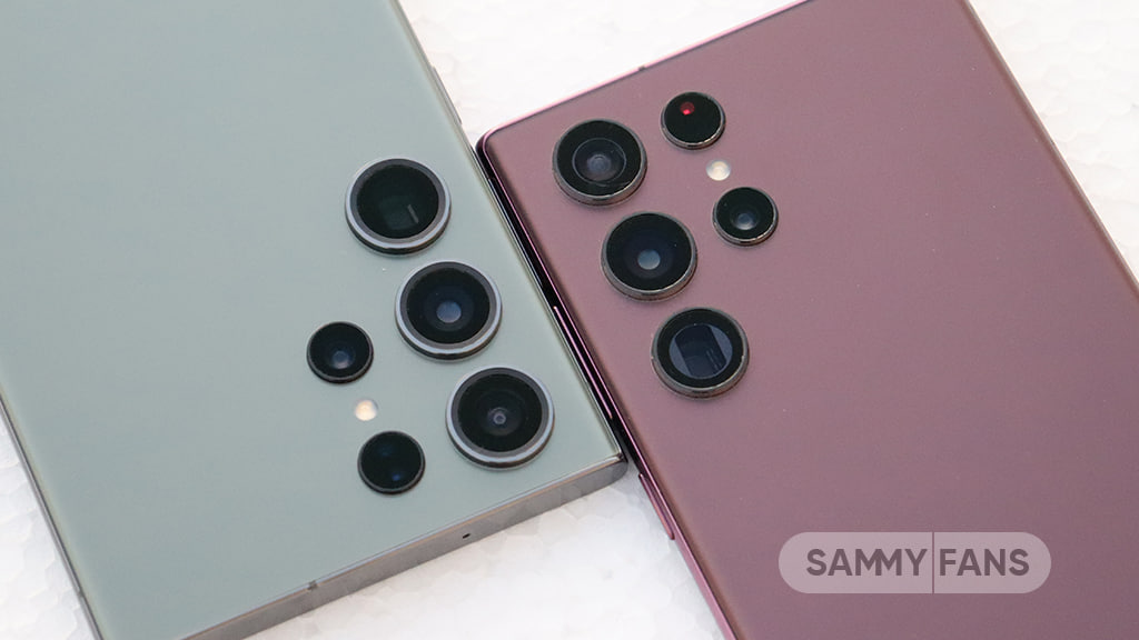
If you look closely at the S23 Ultra, the difference between the camera structure and the aesthetics is barely noticeable. Because the Samsung Galaxy S23 Ultra willfully carries the camera design and layout from the S22 Ultra. Specifically, the first and second columns are identical in both devices. This is causing a variation in opinion among consumers who were expecting a major makeover.
Speaking of major, this flagship stands as a 200MP camera powerhouse. Using a super-resolution sensor, Samsung promises high-quality photography and robust optical image stabilization in videos.
Elegant Tweaks:
Aside from the layout and lens, Samsung Galaxy S23 Ultra brings a brand-new silver outsole ring. This tweak makes the entire module big, bulky, and elegant as compared to the past version.
In terms of appearance, this premium device strikes full marks for those new optimizations and it will definitely catch your eyes on the first look.
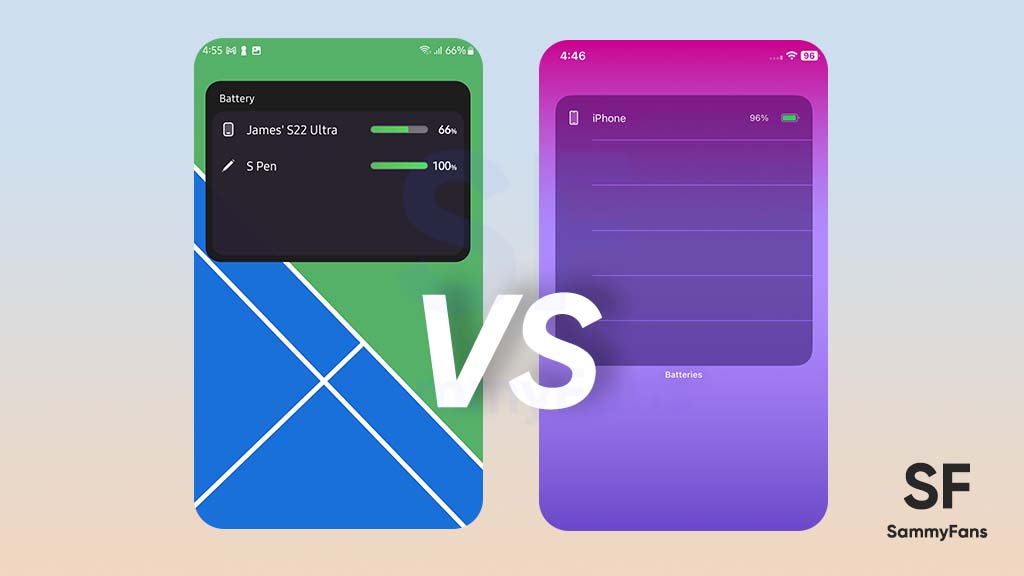
Samsung introduced a new battery status widget feature with the new One UI 5.1 software. Sadly, it’s not a new innovation as Apple’s iOS and Pixel’s Android already have such kind of widgets. Well, here we compare the battery widget of Samsung’s One UI 5.1 and Apple’s iOS 16 operating system.
Follow our socials → Google News, Telegram, Twitter, Facebook
Apple Battery Widget
Since Apple has already brought the battery status widget to iPhones, it has mastered the feature with generation improvements. In the latest iOS 16, there are three different battery widgets available on iPhones including a square (single), a rectangular (list), and a circular (4).
Samsung Battery Widget
Samsung’s battery widget introduces two choices for Galaxy consumers including the circular and square box styles. Both of the choices let you display the battery status of up to 8 devices including the smartphone itself. By default, the widget expands for 4 devices, which can be further enlarged for eight.
Comparison
One UI 5.1’s circular battery widget doesn’t have any background layer as all circles are arranged independently. On the flip side, iOS 16’s circular widget has a transparent layer so it can be clearly visible in any kind of wallpaper or home screen theme.
The One UI 5.1’s circular widget shows the device icon and percentage inside the circle, whereas the iOS takes additional space beside for percentage.


Talking about the second style, the rectangular widget of One UI 5.1 looks way better than the iOS 16’s. It has a solid background layer with an intuitive interface as well as a header, device icon, battery percentage bar, and text.
On the other hand, iOS 16’s rectangular battery widget keeps the same transparent background layer and occupies much space on the home screen. One UI can show the status of up to 8 devices, while iOS is limited to just 4.


Verdict
- Tied!
Apple’s battery status widget is unquestionably mature, compared to the first version of Samsung’s battery widget. Still, Samsung did a pretty good job when it comes to personalization of the widget and usability with a high amount of devices.
The circular widget of Apple looks better than the One UI, while the rectangular-styled widget of One UI clearly defeats iOS. It’s pretty difficult to make a winner in this comparison, as both have their own specialties and limitations. Well, which one do you prefer? Let us know through social media!
Samsung’s Galaxy S23 Ultra and Google’s Pixel 7 Pro are two of the best high-end Android smartphones available in the market. But which one to choose? Here’s a short comparison between these two Android kings.
The Galaxy S23 Ultra and Pixel 7 Pro look completely different, one has the vertical no-module camera set up while the other has a horizontal rear camera design.
Follow our socials → Google News, Telegram, Twitter, Facebook
The Galaxy S23 Ultra offers a bit larger display compared to the Pixel 7 Pro. Also, it is more durable as it uses Gorilla Glass Victus protection. On the other side, the Galaxy phone equips the world’s fastest Snapdragon processor made specifically for Galaxy.
When it comes to software, both phones drive Android 13 out of the box and support four major Android OS upgrades. Meanwhile, the Galaxy phone has some extra features that come with One UI 5.1.
The Camera and the camera features of Galaxy S23 Ultra is so good. It features a 200Mp camera and much improved nighttime photography. Whereas, the camera of the Pixel 7 Pro is also good to compete with the S23 Ultra.
For more information regarding the specifications of these phones, you can check out the comparison table mentioned below:
![]()
Samsung Galaxy S23 Ultra vs Google Pixel 7 Pro:
| Device name | Samsung Galaxy S23 Ultra | Google Pixel 7 Pro |
General
| Release Date | February 1, 2023 | October 6, 2022 |
| Dimensions | Height: 163.3 mm Width: 77.9 mm Thickness: 8.9 mm |
Height: 162.9 mm Width: 76.6 mm Thickness: 8.9 mm |
| Weight | 229 grams | 212 grams |
| S Pen | Yes | No |
Network
| Network Connectivity | 5G Compatible | 5G Compatible |
Processor
| Processor | Qualcomm Snapdragon 8 Gen 2 | Google Tensor G2 |
| CPU | 1×3.36 GHz Cortex-X3 & 2×2.8 GHz Cortex-A715 & 2×2.8 GHz Cortex-A710 & 3×2.0 GHz Cortex-A510 | 2×2.85 GHz Cortex-X1 & 2×2.35 GHz Cortex-A78 & 4×1.80 GHz Cortex-A55 |
| Operating System | Android 13 (One UI 5.1) | Android 13 |
| GPU | Qualcomm Adreno 740 | Mali-G710 MP7 |
Display
| Display Type | Dynamic AMOLED 2X | LTPO AMOLED |
| Screen Size | 6.8″ (120Hz) | 6.7″ (120Hz) |
| Screen Resolution | 1440 x 3088 px, 500 PPI | 1440 x 3120 px, 390 PPI |
Camera
| Rear Camera | Primary: 200MP Ultra Wide: 12MP Telephoto 1: 10MP Telephoto 2: 10MP |
Primary: 50MP Ultra Wide: 48MP Telephoto: 12MP |
| Front Camera | 12MP | 10.8MP |
Battery
| Battery Backup | 5000 mAh | 5000 mAh |
| Fast Charge | Wired: 45W | Wireless: 15W | Wired: 23W | Wireless: 23W |
Verdict: Samsung Galaxy S23 Ultra vs Google Pixel 7 Pro
- Winner – Galaxy S23 Ultra
It is a bit difficult to choose between these two phones as both are great. But since Samsung phones have some extra elements like One UI 5.1 features, Good Lock, Expert RAW, S Pen compatibility, 200MP camera, and advanced nightography, we would go for Galaxy S23 Ultra instead of Pixel 7 Pro.